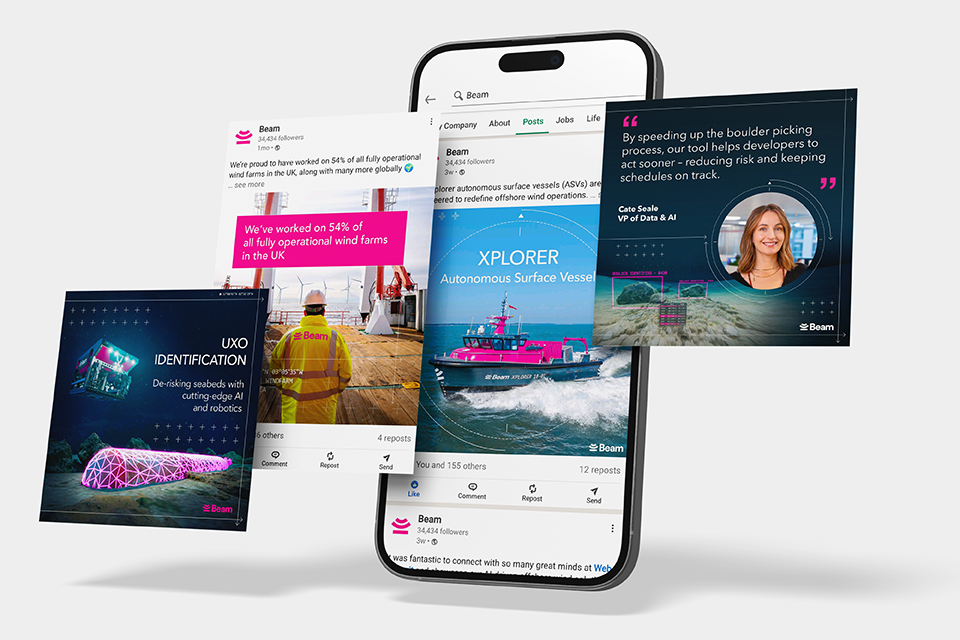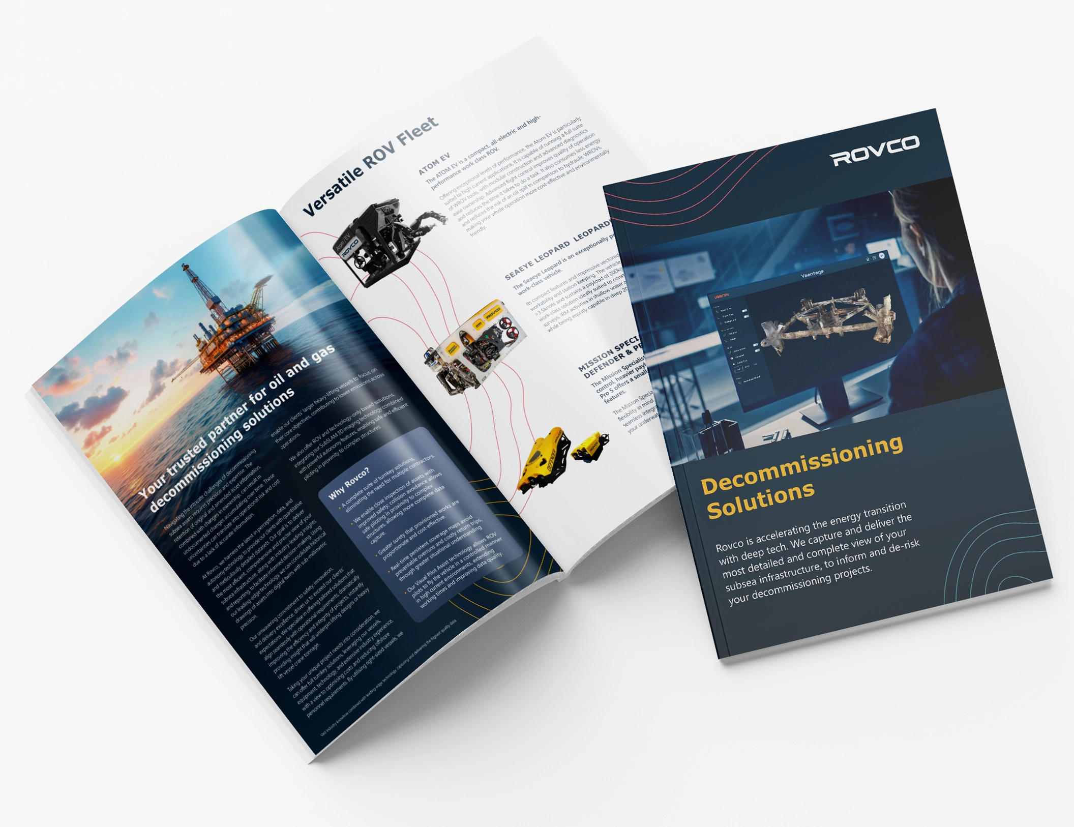


For this project, I had the opportunity to redesign the identity of Omnio, a leading integrated renewable energy developer in the country and part of the British Solar Renewables (BSR) group.
The client's objective was to have a new logo and visual identity that would reflect their business with vibrancy and consistency. To achieve this, I first focused on restyling the logo, making it more geometric, harmonious, and modern. Then, I selected warm colours and combined them to create a gradient that conveys a sense of energy, movement, and progression. I also opted for a sans-serif font for the wordmark to enhance legibility and readability compared to the previous font.
Once the logo was complete, I defined the colour palette, fonts, and overall visual aspects for all the brand materials, resulting in a vibrant, energetic, and progressive identity for the company. This new visual identity is aligned with the client's goals and helps to improve brand recognition and consistency.


